
Avatar
Used for display user’s avatar.
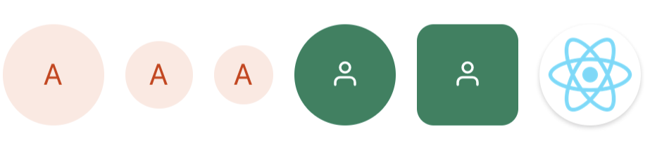
import { Avatar, Icon } from 'react-native-magnus';

<Avatar bg="red300" color="red800">A</Avatar>

<Avatar bg="red300" size={32} color="red800">A</Avatar>

<Avatar bg="red300" size={28} color="red800">A</Avatar>

<Avatar bg="green800">
  <Icon name="user" color="white" fontFamily="Feather" />
</Avatar>

<Avatar bg="green800" rounded="lg">
  <Icon name="user" color="white" fontFamily="Feather" />
</Avatar>

<Avatar
  shadow={1}
  source={{
    uri:
      "https://upload.wikimedia.org/wikipedia/commons/thumb/a/a7/React-icon.svg/1024px-React-icon.svg.png"
  }}
/>
Avatar Group
<Avatar.Group>
  <Avatar bg="red500" color="white">
    A
  </Avatar>
  <Avatar bg="blue500" color="white">
    B
  </Avatar>
  <Avatar bg="yellow500" color="white">
    C
  </Avatar>
</Avatar.Group>
Props
| Property | Description | Type | Default |
|---|---|---|---|
| m | margin | `string | number` |
| mt | margin top | `string | number` |
| mr | margin right | `string | number` |
| mb | margin bottom | `string | number` |
| ml | margin margin left | `string | number` |
| mx | margin horizonal | `string | number` |
| my | margin vertical | `string | number` |
| p | padding | `string | number` |
| pt | padding top | `string | number` |
| pr | padding right | `string | number` |
| pb | padding bottom | `string | number` |
| pl | padding margin left | `string | number` |
| px | padding horizonal | `string | number` |
| py | padding vertical | `string | number` |
| h | height | number | - |
| w | width | number | - |
| bg | background color | string | - |
| size | size for avatar | number | 48 |
| minH | mininmum height | number | - |
| minW | minimum width | string | - |
| rounded | border radius | `string | number` |
| roundedTop | border radius top | `string | number` |
| roundedBottom | border radius bottom | `string | number` |
| roundedLeft | border radius left | `string | number` |
| roundedRight | border radius right | `string | number` |
| borderColor | color for border | string | - |
| borderTopColor | color for border top | string | - |
| borderRightColor | color for border right | string | - |
| borderLeftColor | color for border left | string | - |
| borderBottomColor | color for border bottom | string | - |
| borderWidth | width for border | number | - |
| borderTopWidth | width for border top | number | - |
| borderRightWidth | width for border right | number | - |
| borderLeftWidth | width for border left | number | - |
| borderBottomWidth | width for border bottom | number | - |
| shadow | describe the depth of shadow to be used | number | - |
| shadowColor | color for shadow | string | gray800 |
| position | used to position the childrens | `absolute” | “relative”` |
| top | number of logical pixels to offset the top edge of this component. | number | - |
| right | number of logical pixels to offset the right edge of this component. | number | - |
| bottom | number of logical pixels to offset the bottom edge of this component. | number | - |
| left | number of logical pixels to offset the left edge of this component. | number | - |
| source | image source | ImageSourcePropType | - |
| fontSize | fontSize for text | string | md |