
Button
Button is a wrapper around <TouchableOpacity /> or <TouchableNativeFeedback /> of react-native. It accepts all props supported by them. On iOs, Button renders to TouchableOpacity and on Android, it renders to TouchableNativeFeedback.
Button won’t work with Expo versions < 38. This is because we moved to Pressable component and Pressable is not available in Expo in version < 38. So we recommend using magnus version < 1.0.40 for expo versions < 38.
Example #1
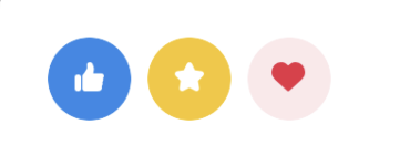
import { Button, Icon, Div } from "react-native-magnus";

<Div row>
  <Button bg="blue500" h={40} w={40} rounded="circle">
    <Icon name="like1" color="white" />
  </Button>
  <Button bg="yellow500" h={40} w={40} rounded="circle" ml="md">
    <Icon name="star" color="white" />
  </Button>
  <Button bg="red100" h={40} w={40} rounded="circle" ml="md">
    <Icon name="heart" color="red500" />
  </Button>
</Div>;
Example #2
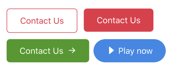
<Div row flexWrap="wrap">
  <Button
    mt="lg"
    px="xl"
    py="lg"
    bg="white"
    borderWidth={1}
    borderColor="red500"
    color="red500"
    underlayColor="red100"
  >
    Contact Us
  </Button>
  <Button
    mt="lg"
    ml="lg"
    px="xl"
    py="lg"
    bg="red500"
    color="white"
    underlayColor="red600"
  >
    Contact Us
  </Button>
  <Button
    mt="lg"
    px="xl"
    py="lg"
    bg="green700"
    color="white"
    suffix={<Icon name="arrowright" ml="md" color="white" />}
  >
    Contact Us
  </Button>
  <Button
    mt="lg"
    ml="md"
    px="xl"
    py="lg"
    bg="blue500"
    rounded="circle"
    color="white"
    shadow={2}
    prefix={<Icon name="caretright" mr="sm" color="white" />}
  >
    Play now
  </Button>
</Div>
Example #3
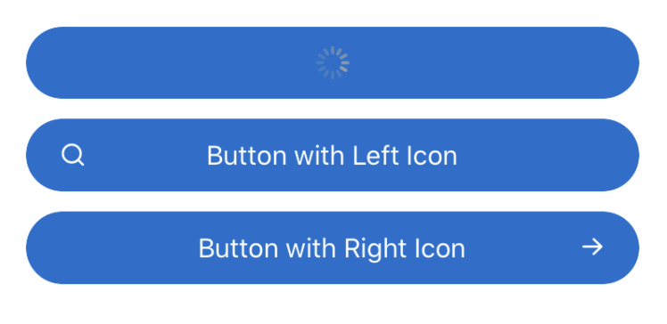
<Button
  loading={true}
  block
  bg="blue600"
  suffix={<Icon name="search" color="white" fontFamily="Feather" />}
  p={12}
  color="white"
  rounded="circle"
  mt="lg">
  Loading State
</Button>
<Button
  block
  prefix={
    <Icon
      position="absolute"
      left={8}
      name="search"
      color="white"
      fontFamily="Feather"
    />
  }
  bg="blue600"
  p={12}
  color="white"
  rounded="circle"
  mt="lg">
  Button with Left Icon
</Button>
<Button
  block
  suffix={
    <Icon
      position="absolute"
      right={8}
      name="arrowright"
      color="white"
    />
  }
  bg="blue600"
  p={12}
  color="white"
  rounded="circle"
  mt="lg">
  Button with Right Icon
</Button>
Example #4
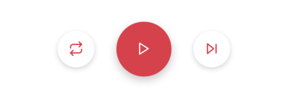
<Div row justifyContent="center" alignItems="center" mt="xl">
  <Button
    bg="white"
    borderless
    shadow="sm"
    h={40}
    w={40}
    rounded="circle"
    alignSelf="center"
  >
    <Icon name="repeat" color="red500" fontFamily="Feather" />
  </Button>
  <Button
    bg="red500"
    h={60}
    w={60}
    mx="xl"
    rounded="circle"
    shadow="md"
    borderless
  >
    <Icon name="play" color="white" fontFamily="Feather" />
  </Button>
  <Button
    bg="white"
    borderless
    shadow="sm"
    h={40}
    w={40}
    rounded="circle"
    alignSelf="center"
  >
    <Icon name="skip-forward" color="red500" fontFamily="Feather" />
  </Button>
</Div>
Example #5
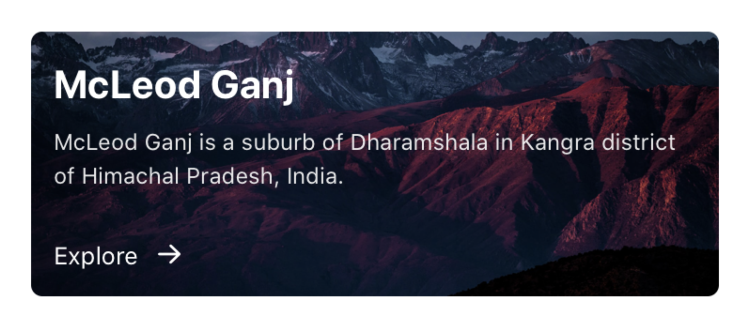
<Button block color="white" p="none">
  <Div
    p="lg"
    flex={1}
    bgImg={{
      uri:
        "https://images.unsplash.com/photo-1477346611705-65d1883cee1e?ixlib=rb-1.2.1&ixid=eyJhcHBfaWQiOjEyMDd9&auto=format&fit=crop&w=1950&q=80",
    }}
  >
    <Text color="white" fontSize="3xl" fontWeight="bold">
      McLeod Ganj
    </Text>
    <Text color="white" fontSize="sm" mt="sm" opacity={0.9}>
      McLeod Ganj is a suburb of Dharamshala in Kangra district of Himachal
      Pradesh, India.
    </Text>
    <Div row mt="xl">
      <Text color="white">Explore</Text>
      <Icon name="arrowright" color="white" ml="md" />
    </Div>
  </Div>
</Button>
Props
Accepts all props supported by TouchableHighlight and TouchableNativeFeedback ( Android only ) of react-native
| Property | Description | Type | Default |
|---|---|---|---|
| m | margin | `string | number` |
| mt | margin top | `string | number` |
| mr | margin right | `string | number` |
| mb | margin bottom | `string | number` |
| ml | margin margin left | `string | number` |
| mx | margin horizonal | `string | number` |
| my | margin vertical | `string | number` |
| p | padding | `string | number` |
| pt | padding top | `string | number` |
| pr | padding right | `string | number` |
| pb | padding bottom | `string | number` |
| pl | padding margin left | `string | number` |
| px | padding horizonal | `string | number` |
| py | padding vertical | `string | number` |
| h | height | number | - |
| w | width | number | - |
| bg | background color | string | blue500 |
| color | text color for button | string | white |
| position | used to position the childrens | `absolute” | “relative”` |
| minH | mininmum height | number | - |
| minW | minimum width | string | - |
| rounded | border radius | string | none |
| loading | loading state for button. Renders the ActivityIndicator inside button when true | boolean | false |
| loaderColor | color for ActivityIndicator for loading state | string | gray400 |
| loaderSize | size for ActivityIndicator for loading state | string | md |
| disabled | disabled state for button. Decreases the opacity and onPress handler won’t work when true | boolean | false |
| borderColor | color for border | string | - |
| borderTopColor | color for border top | string | - |
| borderRightColor | color for border right | string | - |
| borderLeftColor | color for border left | string | - |
| borderBottomColor | color for border bottom | string | - |
| borderWidth | width for border | number | - |
| borderTopWidth | width for border top | number | - |
| borderRightWidth | width for border right | number | - |
| borderLeftWidth | width for border left | number | - |
| borderBottomWidth | width for border bottom | number | - |
| borderless | If the ripple can render outside it’s bounds | boolean | false |
| ripple | If the ripple is enabled in case of android | boolean | true |
| rippleColor | ripple color | string | gray900 |
| suffix | Renders a component on the right of button | ReactNode | - |
| prefix | Renders a component on the left of button | ReactNode | - |
| block | sets the width to 100% when true | boolean | false |
| flex | flex property for container | number | - |
| shadow | describe the depth of shadow to be used | number | - |
| shadowColor | color for shadow | string | - |
| justifyContent | describes how to align children within the main axis of their container | `“flex-start” | “flex-end” |
| top | number of logical pixels to offset the top edge of this component. | number | - |
| right | number of logical pixels to offset the right edge of this component. | number | - |
| bottom | number of logical pixels to offset the bottom edge of this component. | number | - |
| left | number of logical pixels to offset the left edge of this component. | number | - |
| opacity | opacity | number | - |