
Snackbar
Custom component for showing toasts messages at the bottom.
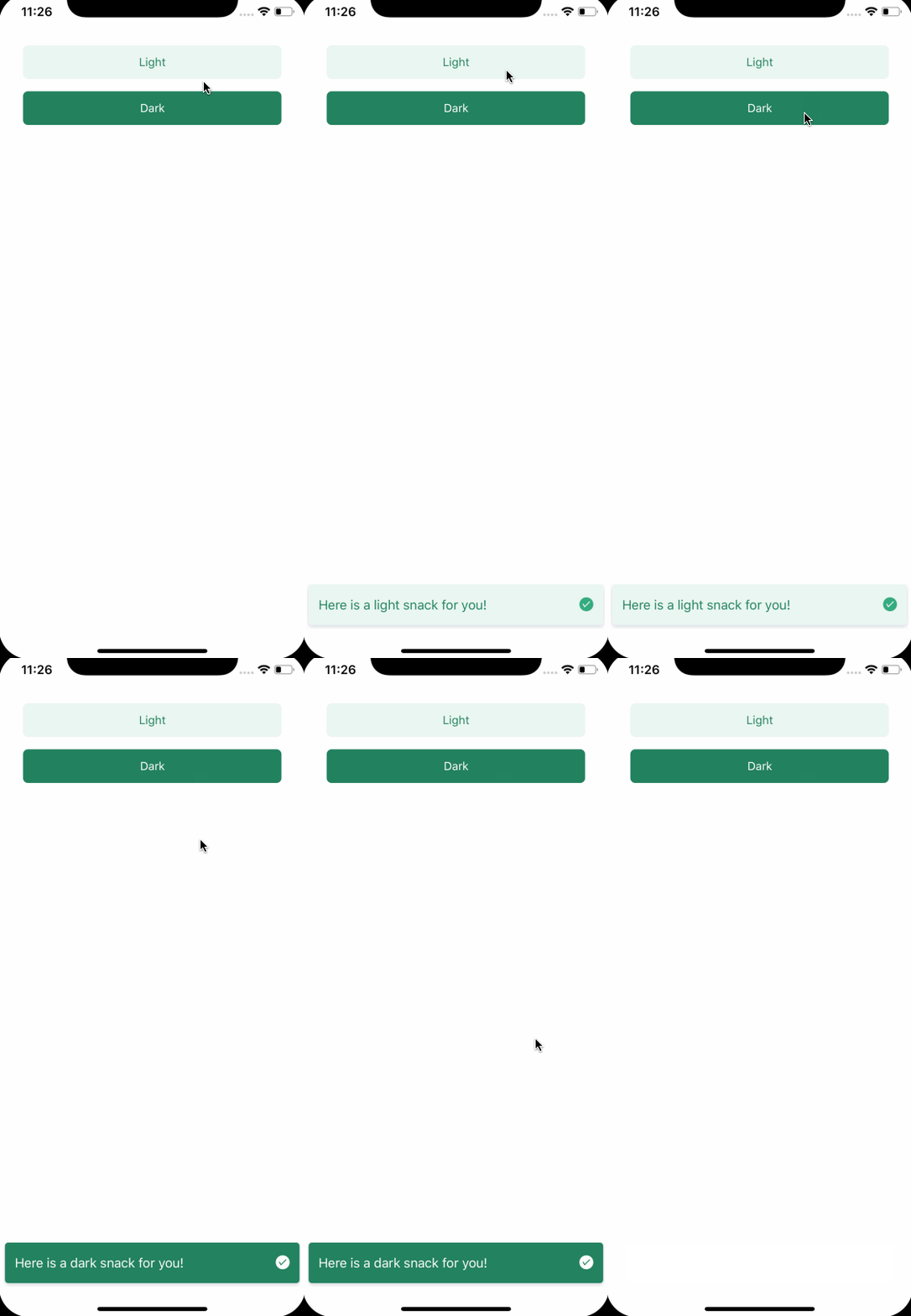
import React from "react";
import { SafeAreaView, StatusBar } from "react-native";
import {
  ThemeProvider,
  Button,
  Icon,
  Snackbar,
  SnackbarRef,
} from "react-native-magnus";

const snackbarRef = React.createRef();

const App = () => {
  return (
    <ThemeProvider>
      <StatusBar barStyle="dark-content" />
      <SafeAreaView style={{ flex: 1 }}>
        <Button
          m="xl"
          onPress={() => {
            if (snackbarRef.current) {
              snackbarRef.current.show(
                "Here is a light snack for you!",
                {
                  duration: 2000,
                  suffix: <Icon
                    name="checkcircle"
                    color="white"
                    fontSize="md"
                    fontFamily="AntDesign"
                  />
                }
              );
            }
          }}
        >
          Open Snackbar
        </Button>
        <Snackbar
          ref={snackbarRef}
          bg="green700"
          color="white"
        >
        </>
      </SafeAreaView>
    </ThemeProvider>
  );
};

export default App;
Props
| Property | Description | Type | Default |
| ----------------- | ------------------------------------------------------ | ---------------------- | --------- | ------ |
| m | margin | string | number | - |
| mt | margin top | string | number | - |
| mr | margin right | string | number | - |
| mb | margin bottom | string | number | - |
| ml | margin margin left | string | number | - |
| mx | margin horizonal | string | number | - |
| my | margin vertical | string | number | - |
| p | padding | string | number | - |
| pt | padding top | string | number | - |
| pr | padding right | string | number | - |
| pb | padding bottom | string | number | - |
| pl | padding margin left | string | number | - |
| px | padding horizonal | string | number | - |
| py | padding vertical | string | number | - |
| p | padding | any | - |
| h | height | number | - |
| rounded | border radius | string | number | none |
| roundedTop | border radius top | string | number | none |
| roundedBottom | border radius bottom | string | number | none |
| roundedLeft | border radius left | string | number | none |
| roundedRight | border radius right | string | number | none |
| borderColor | color for border | string | - |
| borderTopColor | color for border top | string | - |
| borderRightColor | color for border right | string | - |
| borderLeftColor | color for border left | string | - |
| borderBottomColor | color for border bottom | string | - |
| borderWidth | width for border | number | - |
| borderTopWidth | width for border top | number | - |
| borderRightWidth | width for border right | number | - |
| borderLeftWidth | width for border left | number | - |
| borderBottomWidth | width for border bottom | number | - |
| bg | background color | string | white |
| color | color for text | string | gray900 |
| duration | duration for which the snackbar will be shown | number | 7000 |
| suffix | suffix component for snackbar. Can be a icon or button | React.ReactNode | - |
| prefix | prefix component for snackbar. Can be a icon or button | React.ReactNode | - |
| style | custom style object to be used | StyleProp<ViewStyle> | - |
You can pass any prop that is accepted by by <View /> and those props will be passed to snackbar container.