
Select
Single-Valued Component
import React, { useState } from 'react';
import { Button, Select } from 'react-native-magnus'

const [selectValue, setSelectedValue] = useState(null);
const selectRef = React.createRef()

<Button
  flex={1}
  block
  borderWidth={1}
  bg="white"
  color="gray900"
  borderColor="gray300"
  onPress={() => {
    if (selectRef.current) {
      selectRef.current.open();
    }
  }}>
  {selectValue.length ? selectValue.toString() : 'Select'}
</Button>

<Select
  onSelect={onSelectOption}
  ref={selectRef}
  value={selectValue}
  title="This is your title"
  mt="md"
  pb="2xl"
  message="This is the long message used to set some context"
  roundedTop="xl"
  data={[1, 2, 3, 4, 5, 6]}
  renderItem={(item, index) => (
    <Select.Option value={item} py="md" px="xl">
      <Text>Option {index}</Text>
    </Select.Option>
  )}
/>
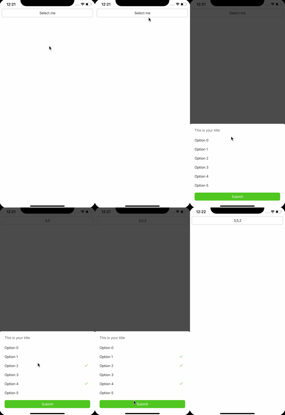
Multi-Valued Component
If you want to have multi-valued select component, just pass the multiple props as true.
import React, { useState } from 'react';
import { Button, Select } from 'react-native-magnus'

const [selectValue, setSelectedValue] = useState([]);
const selectRef = React.createRef()

<Button
  flex={1}
  block
  borderWidth={1}
  bg="white"
  color="gray900"
  borderColor="gray300"
  onPress={() => {
    if (selectRef.current) {
      selectRef.current.open();
    }
  }}>
  {selectValue.length ? selectValue.toString() : 'Select'}
</Button>

<Select
  onSelect={onSelectOption}
  ref={selectRef}
  multiple
  value={selectValue}
  title="This is your title"
  mt="md"
  pb="2xl"
  message="This is the long message used to set some context"
  roundedTop="xl"
  data={[1, 2, 3, 4, 5, 6]}
  renderItem={(item, index) => (
    <Select.Option value={item} py="md" px="xl">
      <Text>Option {index}</Text>
    </Select.Option>
  )}
/>
Props
| Property | Description | Type | Default |
|---|---|---|---|
| m | margin | `string | number` |
| mt | margin top | `string | number` |
| mr | margin right | `string | number` |
| mb | margin bottom | `string | number` |
| ml | margin margin left | `string | number` |
| mx | margin horizonal | `string | number` |
| my | margin vertical | `string | number` |
| p | padding | `string | number` |
| pt | padding top | `string | number` |
| pr | padding right | `string | number` |
| pb | padding bottom | `string | number` |
| pl | padding margin left | `string | number` |
| px | padding horizonal | `string | number` |
| py | padding vertical | `string | number` |
| h | height | number | - |
| bg | background color | string | - |
| rounded | border radius | `string | number` |
| roundedTop | border radius top | `string | number` |
| roundedBottom | border radius bottom | `string | number` |
| roundedLeft | border radius left | `string | number` |
| roundedRight | border radius right | `string | number` |
| borderColor | color for border | string | - |
| borderTopColor | color for border top | string | - |
| borderRightColor | color for border right | string | - |
| borderLeftColor | color for border left | string | - |
| borderBottomColor | color for border bottom | string | - |
| borderWidth | width for border | number | - |
| borderTopWidth | width for border top | number | - |
| borderRightWidth | width for border right | number | - |
| borderLeftWidth | width for border left | number | - |
| borderBottomWidth | width for border bottom | number | - |
| title | title to be used above options | `string | React.ReactNode` |
| multiple | multiple options can be selected or not | boolean | false |
| value | value of select | `any | any[]` |
| footer | footer to be used below options. Submit button is shown when multiple is true | React.ReactNode | - |
| onSelect | callback trigger when a option is selected. In case when multipe is true, onSelect give array of values. Otherwise gives single value | onSelect(value: any) => void | - |
| data | data to be used to render options | any[] | - |
| renderItem | callback used to render options in the flatlist | renderItem: (item: any, index: number) => React.ReactElement | - |
| keyExtractor | callback used to give unique id to flatlist items | keyExtractor: (item: any, index: number) => string; | - |