
Checkbox
Custom components for rendering checkbox input

import React from "react";
import { SafeAreaView, StatusBar } from "react-native";
import { Div, ThemeProvider, Checkbox } from "react-native-magnus";

const App = () => {
  return (
    <ThemeProvider>
      <StatusBar barStyle="dark-content" />
      <SafeAreaView style={{ flex: 1 }}>
        <Div m="lg">
          <Div>
            <Div row>
              <Checkbox value={1} />
              <Checkbox value={2} defaultChecked />
              <Checkbox value={3} activeColor="green500" />
              <Checkbox value={4} disabled />
              <Checkbox value={5} loading />
            </Div>
          </Div>
        </Div>
      </SafeAreaView>
    </ThemeProvider>
  );
};

export default App;
Example 1
Checkbox with prefix text
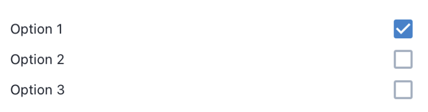
import React from "react";
import { SafeAreaView, StatusBar } from "react-native";
import { Div, ThemeProvider, Checkbox, Text } from "react-native-magnus";

const App = () => {
  return (
    <ThemeProvider>
      <StatusBar barStyle="dark-content" />
      <SafeAreaView style={{ flex: 1 }}>
        <Div m="lg">
          <Div>
            <Div>
              <Checkbox value={1} prefix={<Text flex={1}>Option 1</Text>} />
              <Checkbox value={2} prefix={<Text flex={1}>Option 2</Text>} />
              <Checkbox value={3} prefix={<Text flex={1}>Option 3</Text>} />
            </Div>
          </Div>
        </Div>
      </SafeAreaView>
    </ThemeProvider>
  );
};

export default App;
Example 2
Custom renderer
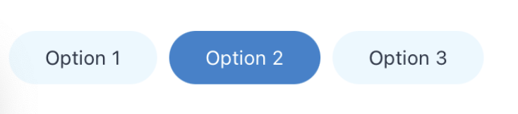
import React from "react";
import { SafeAreaView, StatusBar } from "react-native";
import { Div, ThemeProvider, Checkbox, Text } from "react-native-magnus";

const App = () => {
  return (
    <ThemeProvider>
      <StatusBar barStyle="dark-content" />
      <SafeAreaView style={{ flex: 1 }}>
        <Div m="lg">
          <Checkbox.Group row>
            {["Option 1", "Option 2", "Option 3"].map((item) => (
              <Checkbox value={item}>
                {({ checked }) => (
                  <Div
                    bg={checked ? "blue600" : "blue100"}
                    px="xl"
                    py="md"
                    mr="md"
                    rounded="circle"
                  >
                    <Text color={checked ? "white" : "gray800"}>{item}</Text>
                  </Div>
                )}
              </Checkbox>
            ))}
          </Checkbox.Group>
        </Div>
      </SafeAreaView>
    </ThemeProvider>
  );
};

export default App;
Props
Checkbox
| Property | Description | Type | Default |
|---|---|---|---|
| onChange | event triggered on toggling the checkbox | `((value: any) => void) | undefined;` |
| checked | state to control the state of checkbox | boolean | - |
| loading | shows ActivityIndicator when true | boolean | false |
| disabled | show disabled icon when true | boolean | false |
| fontSize | font size for icon | string | md |
| activeColor | color for icon when checkbox is checked | string | blue600 |
| inactiveColor | color for icon when checkbox is unchecked | string | gray400 |
Checkbox.Group
Checkbox group is a wrapper around Div component. So it accepts all props of Div along with following extra props.
| Property | Description | Type | Default |
|---|---|---|---|
| onChange | event triggered on toggling the checkbox | `((values: any[]) => void) | undefined;` |
| value | value for the checkbox group | any[] | [] |
| defaultValue | default value for the checkbox group | any[] | [] |