
Skeleton
Custom component to show the skeleton loading
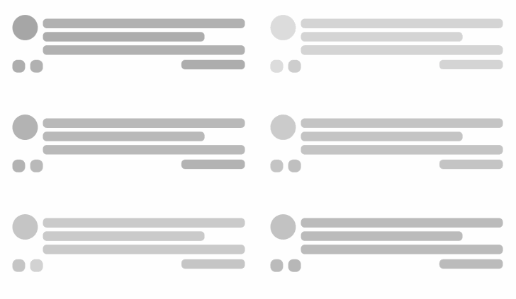
import { Skeleton } from 'react-native-magnus'

<Div flexDir="row" mt="md">
  <Skeleton.Circle h={40} w={40} />
  <Div ml="md" flex={1}>
    <Skeleton.Box mt="sm" />
    <Skeleton.Box mt="sm" w="80%" />
    <Skeleton.Box mt="sm" />
  </Div>
</Div>
<Div flexDir="row" mt="md">
  <Skeleton.Circle h={20} w={20} rounded="lg" />
  <Skeleton.Circle h={20} w={20} rounded="lg" ml="md" />
  <Div alignItems="flex-end" flex={1}>
    <Skeleton.Box h={20} w={100}></Skeleton.Box>
  </Div>
</Div>
Props
| Property | Description | Type | Default |
|---|---|---|---|
| m | margin | `string | number` |
| mt | margin top | `string | number` |
| mr | margin right | `string | number` |
| mb | margin bottom | `string | number` |
| ml | margin margin left | `string | number` |
| mx | margin horizonal | `string | number` |
| my | margin vertical | `string | number` |
| p | padding | `string | number` |
| pt | padding top | `string | number` |
| pr | padding right | `string | number` |
| pb | padding bottom | `string | number` |
| pl | padding margin left | `string | number` |
| px | padding horizonal | `string | number` |
| py | padding vertical | `string | number` |
| p | margin | `string | number` |
| bg | background color for container | string | - |
| h | height | number | - |
| w | width | number | - |
| roundedTop | border radius top | `string | number` |
| roundedBottom | border radius bottom | `string | number` |
| roundedLeft | border radius left | `string | number` |
| roundedRight | border radius right | `string | number` |
| borderColor | color for border | string | - |
| borderTopColor | color for border top | string | - |
| borderRightColor | color for border right | string | - |
| borderLeftColor | color for border left | string | - |
| borderBottomColor | color for border bottom | string | - |
| borderWidth | width for border | number | - |
| borderTopWidth | width for border top | number | - |
| borderRightWidth | width for border right | number | - |
| borderLeftWidth | width for border left | number | - |
| borderBottomWidth | width for border bottom | number | - |
| flex | flex property for container | number | - |