
Dropdown
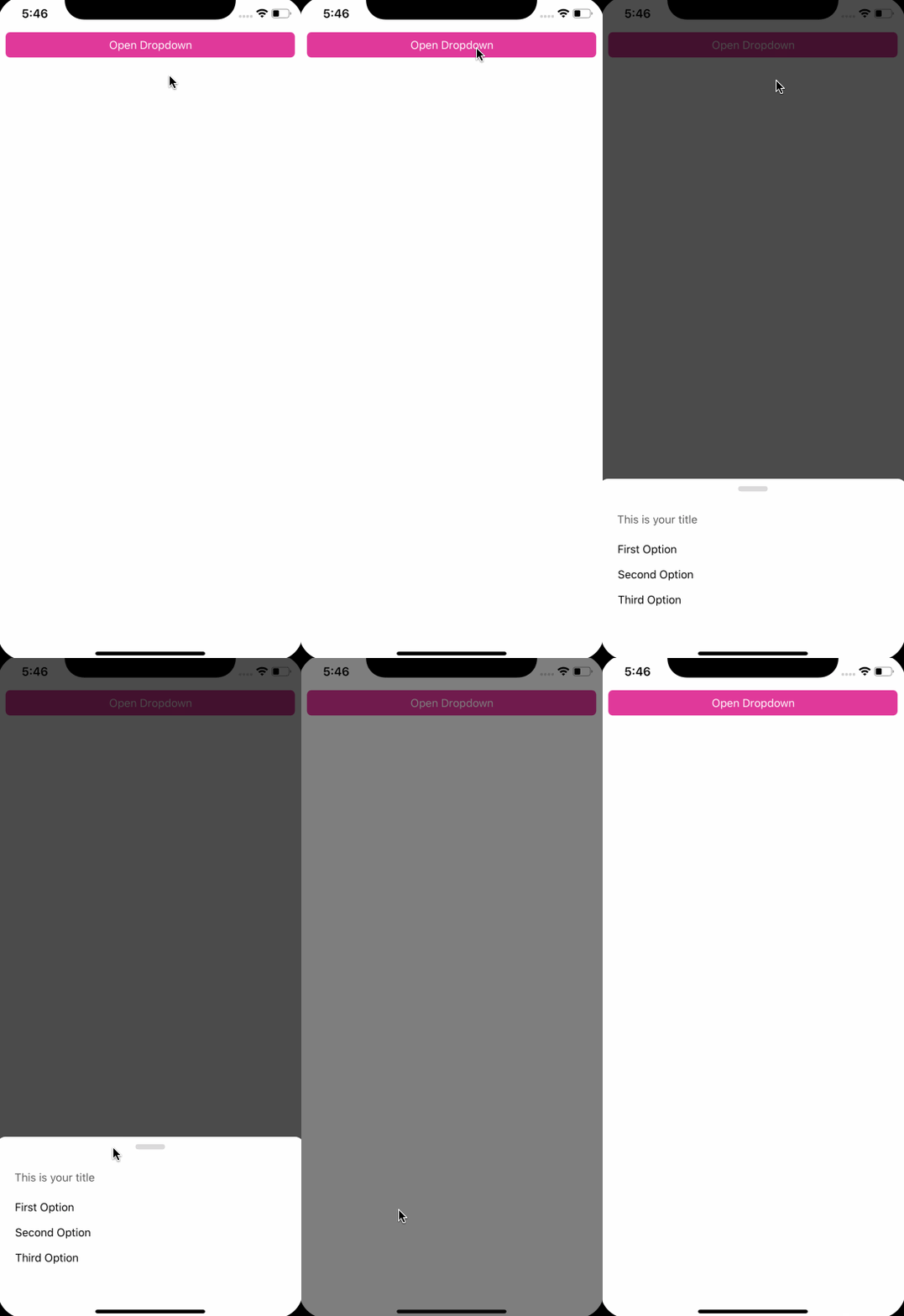
import { Dropdown, Button } from "react-native-magnus";


const dropdownRef = React.createRef();

<Button
  block
  bg="pink500"
  mt="sm"
  p="md"
  color="white"
  onPress={() => dropdownRef.current.open()}>
  Open Dropdown
</Button>

 <Dropdown
  ref={dropdownRef}
  title={
    <Text mx="xl" color="gray500" pb="md">
      This is your title
    </Text>
  }
  mt="md"
  pb="2xl"
  showSwipeIndicator={true}
  roundedTop="xl">
  <Dropdown.Option py="md" px="xl" block>
    First Option
  </Dropdown.Option>
  <Dropdown.Option py="md" px="xl" block>
    Second Option
  </Dropdown.Option>
  <Dropdown.Option py="md" px="xl" block>
    Third Option
  </Dropdown.Option>
</Dropdown>
Example #1
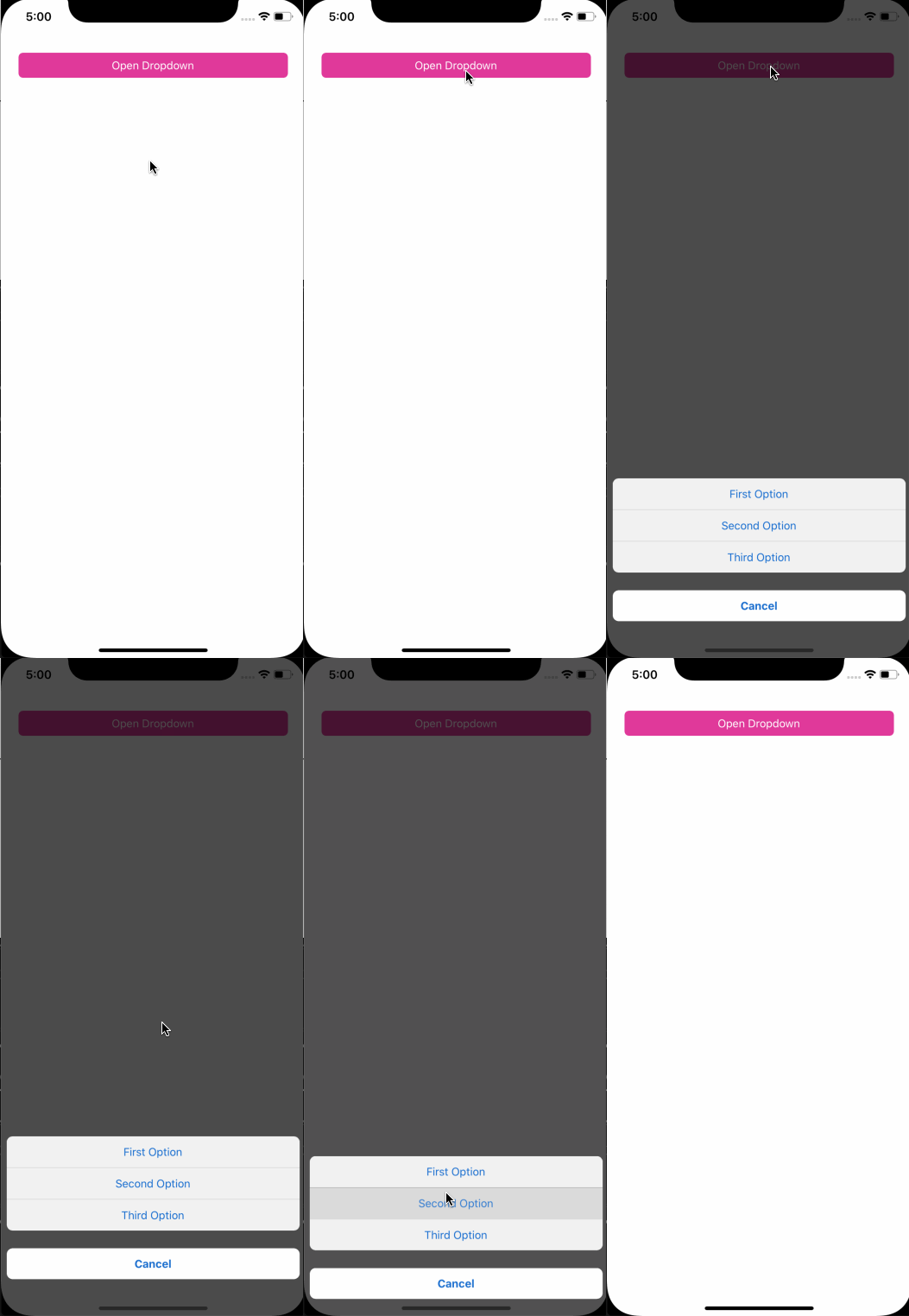
import { Dropdown, Button } from "react-native-magnus";

const dropdownRef = React.createRef();

<Button
  block
  bg="pink500"
  mt="sm"
  p="md"
  color="white"
  onPress={() => dropdownRef.current.open()}>
  Open Dropdown
</Button>

 <Dropdown.Container
  ref={dropdownRef}
  m="md"
  pb="md"
  bg="transparent"
  showSwipeIndicator={false}
  roundedTop="xl">
  <Dropdown.Option
    block
    bg="gray100"
    color="blue600"
    py="lg"
    px="xl"
    borderBottomWidth={1}
    borderBottomColor="gray200"
    justifyContent="center"
    roundedTop="lg">
    First Option
  </Dropdown.Option>
  <Dropdown.Option
    block
    borderBottomWidth={1}
    borderBottomColor="gray200"
    bg="gray100"
    color="blue600"
    py="lg"
    px="xl"
    justifyContent="center">
    Second Option
  </Dropdown.Option>
  <Dropdown.Option
    block
    color="red500"
    underlayColor="gray100"
    py="lg"
    mt="xl"
    px="xl"
    fontWeight="bold"
    justifyContent="center"
    rounded="lg">
    Cancel
  </Dropdown.Option>
</Dropdown.Container>
Example #2
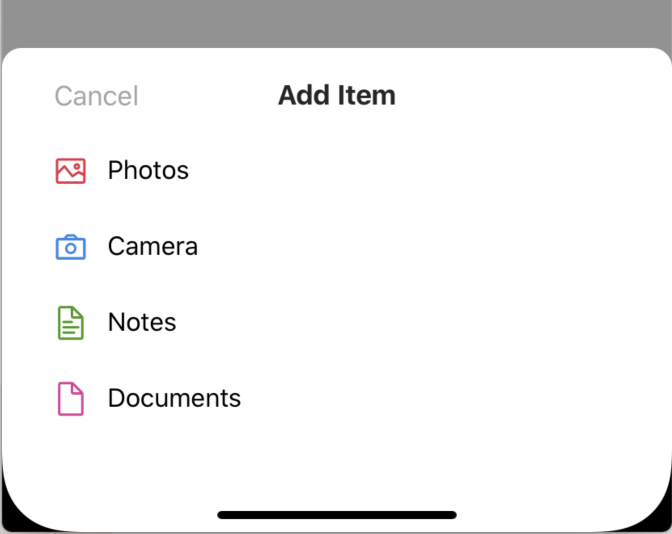
import { Dropdown, Button } from "react-native-magnus";

const dropdownRef = React.createRef();

<Button
  block
  bg="pink500"
  mt="sm"
  p="md"
  color="white"
  onPress={() => dropdownRef.current.open()}>
  Open Dropdown
</Button>

<Dropdown.Container
  ref={dropdownRef}
  title={
    <Div row mx="xl" alignItems="center" p="md" pb="lg">
      <Button
        bg="transparent"
        color="gray400"
        position="absolute"
        left={0}
        top={3}
        fontSize="xl"
        zIndex={1}
        onPress={() => dropdownRef.current.close()}>
        Cancel
      </Button>
      <Text
        color="gray900"
        textAlign="center"
        flex={1}
        fontSize="xl"
        fontWeight="bold">
        Add Item
      </Text>
    </Div>
  }
  mt="md"
  pb="xl"
  showSwipeIndicator={false}
  roundedTop="xl">
  <Dropdown.Option
    py="lg"
    mx="xl"
    px="md"
    block
    prefix={
      <Icon name="picture" mr="lg" color="red500" fontSize="3xl" />
    }>
    Photos
  </Dropdown.Option>
  <Dropdown.Option
    py="lg"
    mx="xl"
    px="md"
    block
    prefix={
      <Icon name="camerao" mr="lg" color="blue500" fontSize="3xl" />
    }>
    Camera
  </Dropdown.Option>
  <Dropdown.Option
    py="lg"
    mx="xl"
    px="md"
    block
    prefix={
      <Icon
        name="filetext1"
        mr="lg"
        color="green700"
        fontSize="3xl"
      />
    }>
    Notes
  </Dropdown.Option>
  <Dropdown.Option
    py="lg"
    mx="xl"
    px="md"
    block
    prefix={
      <Icon name="file1" mr="lg" color="pink500" fontSize="3xl" />
    }>
    Documents
  </Dropdown.Option>
</Dropdown.Container>
Props
Dropdown Container
| Property | Description | Type | Default |
|---|---|---|---|
| m | margin | any | - |
| p | padding | any | - |
| h | height of container | number | - |
| bg | background color | string | blue500 |
| minH | mininmum height | number | - |
| minW | minimum width | string | - |
| rounded | border radius | `string | number` |
| roundedTop | border radius top | `string | number` |
| roundedBottom | border radius bottom | `string | number` |
| roundedLeft | border radius left | `string | number` |
| roundedRight | border radius right | `string | number` |
| borderColor | color for border | any | - |
| borderColor | color for border | string | - |
| borderTopColor | color for border top | string | - |
| borderRightColor | color for border right | string | - |
| borderLeftColor | color for border left | string | - |
| borderBottomColor | color for border bottom | string | - |
| borderWidth | width for border | number | - |
| borderTopWidth | width for border top | number | - |
| borderRightWidth | width for border right | number | - |
| borderLeftWidth | width for border left | number | - |
| borderBottomWidth | width for border bottom | number | - |
| borderWidth | width for border | any | - |
| showSwipeIndicator | shows swipe indicator in the container | boolean | - |
| title | shows title in the container | `string | React.ReactNode` |
Dropdown Option
Dropdown.Option is just an Button, so it accepts all props of Button component.