
Div
Wrapper around <View /> of react native. It accepts every props that is available for <View />

import { Div, Text } from "react-native-magnus";

<Div p="xl" shadow="sm" rounded="md">
  <Text textAlign="center">This is a Div</Text>
</Div>;
You can also import Box which is an alias to Div. This is done because many users are familiar with styled system and those will like using Box instead of Div.
Background Colors

<Div h={40} w={40} bg="pink500"></Div>
<Div h={40} w={40} bg="green500"></Div>
<Div h={40} w={40} bg="teal500"></Div>
<Div h={40} w={40} bg="yellow500"></Div>
<Div h={40} w={40} bg="red500"></Div>
<Div h={40} w={40} bg="blue500"></Div>
<Div h={40} w={40} bg="gray500"></Div>
You can check complete list of colors from here
Borders

<Div h={40} w={40} bg="green200" borderColor="green500" borderWidth={1} />
<Div h={40} w={40} bg="yellow200" borderColor="yellow500" borderWidth={1} />
<Div h={40} w={40} bg="red200" borderColor="red500" borderWidth={1} />
<Div h={40} w={40} bg="blue200" borderColor="blue500" borderWidth={1} />
<Div h={40} w={40} bg="gray200" borderColor="gray500" borderWidth={1} />
Shadows
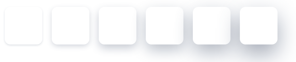
<Div h={40} w={40} rounded="md" shadow="xs"></Div>
<Div h={40} w={40} rounded="md" shadow="sm"></Div>
<Div h={40} w={40} rounded="md" shadow="md"></Div>
<Div h={40} w={40} rounded="md" shadow="lg"></Div>
<Div h={40} w={40} rounded="md" shadow="xl"></Div>
<Div h={40} w={40} rounded="md" shadow="2xl"></Div>
Border radius

<Div h={40} w={40} bg="teal500"></Div>
<Div h={40} w={40} bg="teal500" rounded="sm"></Div>
<Div h={40} w={40} bg="teal500" rounded="md"></Div>
<Div h={40} w={40} bg="teal500" rounded="lg"></Div>
<Div h={40} w={40} bg="teal500" rounded="xl"></Div>
Flex

<Div row m="xl">
  <Div h={40} flex={3} bg="red500" />
  <Div h={40} flex={1} mx="sm" bg="yellow500" />
  <Div h={40} flex={2} bg="green500" />
</Div>
Example #1
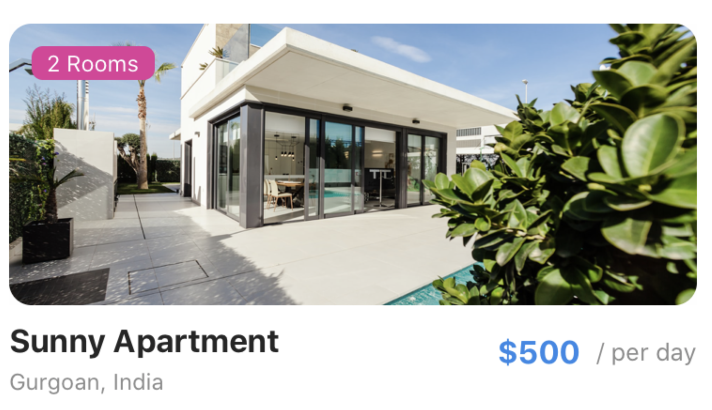
<Div m="xl">
  <Div>
    <Div
      rounded="xl"
      h={150}
      bgImg={{
        uri:
          "https://images.unsplash.com/photo-1512917774080-9991f1c4c750?ixlib=rb-1.2.1&ixid=eyJhcHBfaWQiOjEyMDd9&auto=format&fit=crop&w=1950&q=80",
      }}
    >
      <Div
        bg="pink500"
        rounded="md"
        row
        flexWrap="wrap"
        px="md"
        m="lg"
        alignSelf="flex-start"
      >
        <Text color="white" fontSize="sm">
          2 Rooms
        </Text>
      </Div>
    </Div>
    <Div row alignItems="center">
      <Div flex={1}>
        <Text fontWeight="bold" fontSize="xl" mt="sm">
          Sunny Apartment
        </Text>
        <Text color="gray500" fontSize="sm">
          Gurgoan, India
        </Text>
      </Div>
      <Div row alignItems="center">
        <Text color="blue500" fontWeight="bold" fontSize="xl">
          $500
        </Text>
        <Text color="gray500" ml="md">
          / per day
        </Text>
      </Div>
    </Div>
  </Div>
</Div>
Props
| Property | Description | Type | Default |
|---|---|---|---|
| m | margin | `string | number` |
| mt | margin top | `string | number` |
| mr | margin right | `string | number` |
| mb | margin bottom | `string | number` |
| ml | margin margin left | `string | number` |
| mx | margin horizonal | `string | number` |
| my | margin vertical | `string | number` |
| p | padding | `string | number` |
| pt | padding top | `string | number` |
| pr | padding right | `string | number` |
| pb | padding bottom | `string | number` |
| pl | padding margin left | `string | number` |
| px | padding horizonal | `string | number` |
| py | padding vertical | `string | number` |
| h | height | number | - |
| w | width | number | - |
| bg | background color | string | - |
| minH | mininmum height | number | - |
| minW | minimum width | string | - |
| bgImg | background image | ImageSourcePropType | - |
| bgMode | resize mode for background image | `“contain” | “cover” |
| rounded | border radius | `string | number` |
| roundedTop | border radius top | `string | number` |
| roundedBottom | border radius bottom | `string | number` |
| roundedLeft | border radius left | `string | number` |
| roundedRight | border radius right | `string | number` |
| borderColor | color for border | string | - |
| borderTopColor | color for border top | string | - |
| borderRightColor | color for border right | string | - |
| borderLeftColor | color for border left | string | - |
| borderBottomColor | color for border bottom | string | - |
| borderWidth | width for border | number | - |
| borderTopWidth | width for border top | number | - |
| borderRightWidth | width for border right | number | - |
| borderLeftWidth | width for border left | number | - |
| borderBottomWidth | width for border bottom | number | - |
| flex | flex property for container | number | - |
| row | makes flex direction to row when true | boolean | - |
| shadow | describe the depth of shadow | number | - |
| shadowColor | color for shadow | string | - |
| justifyContent | describes how to align children within the main axis of their container | `“flex-start” | “flex-end” |
| alignItems | describes how to align children along the cross axis of their container | `“flex-start” | “flex-end” |
| flexDir | controls the direction in which children of a node are laid out | `“row” | “column” |
| flexWrap | controls what happens when children overflow the size of the container along the main axis | `“wrap” | “nowrap” |
| position | used to position the childrens | `absolute” | “relative”` |
| top | number of logical pixels to offset the top edge of this component. | number | - |
| right | number of logical pixels to offset the right edge of this component. | number | - |
| bottom | number of logical pixels to offset the bottom edge of this component. | number | - |
| left | number of logical pixels to offset the left edge of this component. | number | - |
| opacity | opacity of div | number | - |
| alignSelf | alignment for the selected item inside the flexible container. | `‘auto’ | ‘flex-start’ |
| overflow | controls how children are measured and displayed | `“visible” | “scroll” |