
Tooltip
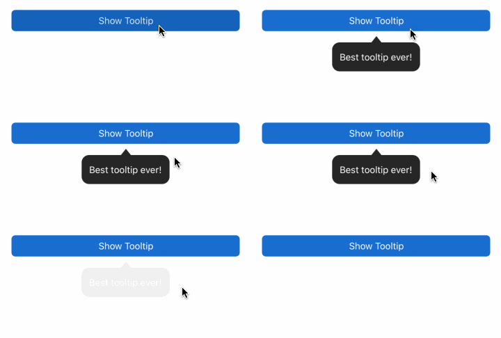
import { Tooltip, Button } from "react-native-magnus";

const tooltipRef = React.createRef();

<Tooltip ref={tooltipRef} text="Best tooltip ever!">
  <Button
    mt="sm"
    block
    onPress={() => {
      if (tooltipRef.current) {
        tooltipRef.current.show();
      }
    }}
  >
    Show Tooltip
  </Button>
</Tooltip>;
Custom tooltip
You can also create custom tooltip content by passing a component instead of string in text prop.
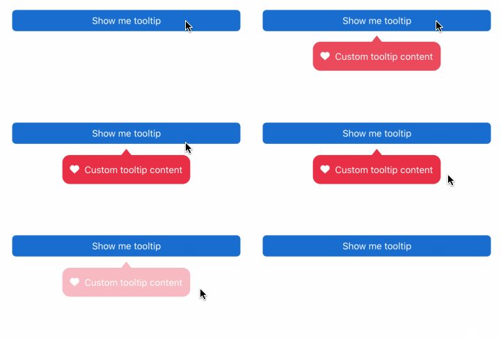
import { Tooltip, Button } from "react-native-magnus";

const tooltipRef = React.createRef();

<Tooltip
  ref={tooltipRef}
  text={
    <Row bg="transparent" alignItems="center" justifyContent="center">
      <Icon name="heart" color="white" />
      <Text color="white" ml="md">
        Custom tooltip content
      </Text>
    </Row>
  }
  bg="red500"
>
  <Button
    mt="sm"
    block
    onPress={() => {
      if (tooltipRef.current) {
        tooltipRef.current.show();
      }
    }}
  >
    Show me tooltip
  </Button>
</Tooltip>;
Props
| Property | Description | Type | Default |
|---|---|---|---|
| m | margin | `string | number` |
| mt | margin top | `string | number` |
| mr | margin right | `string | number` |
| mb | margin bottom | `string | number` |
| ml | margin margin left | `string | number` |
| mx | margin horizonal | `string | number` |
| my | margin vertical | `string | number` |
| p | padding | `string | number` |
| pt | padding top | `string | number` |
| pr | padding right | `string | number` |
| pb | padding bottom | `string | number` |
| pl | padding margin left | `string | number` |
| px | padding horizonal | `string | number` |
| py | padding vertical | `string | number` |
| h | height | number | - |
| w | width | number | - |
| bg | background color | string | - |
| minH | mininmum height | number | - |
| minW | minimum width | string | - |
| rounded | border radius | `string | number` |
| roundedTop | border radius top | `string | number` |
| roundedBottom | border radius bottom | `string | number` |
| roundedLeft | border radius left | `string | number` |
| roundedRight | border radius right | `string | number` |
| borderColor | color for border | string | - |
| borderTopColor | color for border top | string | - |
| borderRightColor | color for border right | string | - |
| borderLeftColor | color for border left | string | - |
| borderBottomColor | color for border bottom | string | - |
| borderWidth | width for border | number | - |
| borderTopWidth | width for border top | number | - |
| borderRightWidth | width for border right | number | - |
| borderLeftWidth | width for border left | number | - |
| borderBottomWidth | width for border bottom | number | - |
| flex | flex property for container | number | - |
| justifyContent | describes how to align children within the main axis of their container | `“flex-start” | “flex-end” |
| alignItems | describes how to align children along the cross axis of their container | `“flex-start” | “flex-end” |
| flexDir | controls the direction in which children of a node are laid out | `“row” | “column” |
| flexWrap | controls what happens when children overflow the size of the container along the main axis | `“wrap” | “nowrap” |
| flexWrap | controls what happens when children overflow the size of the container along the main axis | `“wrap” | “nowrap” |
| text | content of tooltip | `“string” | ReactNode` |