
Fab
Renders floating action button
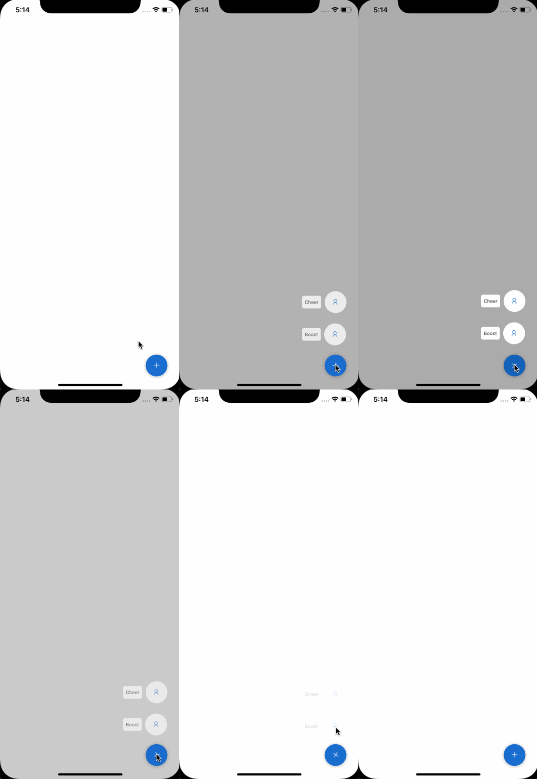
import { Fab } from "react-native-magnus";

<Fab bg="blue600" h={50} w={50}>
  <Button p="none" bg="transparent" justifyContent="flex-end">
    <Div rounded="sm" bg="white" p="sm">
      <Text fontSize="md">Cheer</Text>
    </Div>
    <Icon
      name="user"
      color="blue600"
      h={50}
      w={50}
      rounded="circle"
      ml="md"
      bg="white"
    />
  </Button>
  <Button p="none" bg="transparent" justifyContent="flex-end">
    <Div rounded="sm" bg="white" p="sm">
      <Text fontSize="md">Boost</Text>
    </Div>
    <Icon
      name="user"
      color="blue600"
      h={50}
      w={50}
      rounded="circle"
      ml="md"
      bg="white"
    />
  </Button>
</Fab>;
Props
| Property | Description | Type | Default |
|---|---|---|---|
| h | height of fab button | number | 40 |
| w | width of fab button | number | 40 |
| bg | background color | string | red500 |
| color | color of icon | string | white |
| fontSize | fontSize of icon | string | text500 |
| overlayColor | backgorund color of overlay | string | gray700 |
| overlayOpacity | opacity of overlay | string | 0.5 |
| position | used to position the childrens | `absolute” | “relative”` |
| right | number of logical pixels to offset the right edge of this component. | number | 30 |
| bottom | number of logical pixels to offset the bottom edge of this component. | number | 30 |
| openOnMount | opens the fab if true | boolean | false |
| showOverlay | shows the overlay if true | boolean | true |
| animated | if animation is enabled | boolean | true |
| icon | icon component of fab ( default is plus of AntDesign) | `string | React.ReactNode` |
| activeIcon | active icon component of fab when fab is in active state ( default is close of AntDesign) | `string | React.ReactNode` |
| rounded | border radius | `string | number` |
| roundedTop | border radius top | `string | number` |
| roundedBottom | border radius bottom | `string | number` |
| roundedLeft | border radius left | `string | number` |
| roundedRight | border radius right | `string | number` |
| shadow | shadow level of fab button | number | 3 |
| shadowColor | shadow color of fab button | string | gray900 |
| ripple | If the ripple is enabled in case of android | boolean | true |
| rippleColor | ripple color | string | gray900 |
| borderless | If the ripple can render outside it’s bounds | boolean | false |
| disabled | disabled state for button. Decreases the opacity and onPress handler won’t work when true | boolean | false |
| loading | loading state for button. Renders the ActivityIndicator inside button when true | boolean | false |
| loaderColor | color for ActivityIndicator for loading state | string | gray400 |
| loaderSize | size for ActivityIndicator for loading state | string | md |
| borderColor | color for border | string | - |
| borderTopColor | color for border top | string | - |
| borderRightColor | color for border right | string | - |
| borderLeftColor | color for border left | string | - |
| borderBottomColor | color for border bottom | string | - |
| borderWidth | width for border | number | - |
| borderTopWidth | width for border top | number | - |
| borderRightWidth | width for border right | number | - |
| borderLeftWidth | width for border left | number | - |
| borderBottomWidth | width for border bottom | number | - |
| opacity | opacity | number | - |
| onPress | event triggered on pressing the fab. Childrens won’t appear this prop is used. | `((event: RNGestureResponderEvent) => void) | undefined;` |